Showing posts with label Class. Show all posts

Sunday, 21 August 2016

Lecture 11 - Week 6

Lecture - Mounting and printing


Layout the documents side to side on an A1 print or have separate prints on A2.


When handing in -

Board
Double side tape on top
White sheet over top
Rationale + Photo of wall with photos photoshopped
Rationale 150 words for each poster?
Dropbox

Thursday 9am - Everything finished for handing in.


Tutorial -

Getting a final critique before sending to the printers - 


Looking at the posters in the 'real world', they both stand out over other posters and look clear and legible. They draw in your eyes with the green and yellow contrast.


Critique:

Jacquie said just slightly tweak the body text but otherwise the posters clearly represent the ideas.

Matt said visually it looks resolved. As long as I have experimented the colours well... I believe throughout this development I have changed the colour scheme many times and this is the best - resolved idea.

Wednesday, 17 August 2016

Lecture 10 - Week 5

Critique with Jacquie and Matt:


From this critique I have a lot of points to work on - see notes. From here I will develop it before the end of class and then get another critique on this and hope this is well resolved.

Developing further:


Developed the eye - this is now more balances and looks more interesting and less distracting.

Looking and ensuring my work fits within my grid.

Lightening the orange eye a little bit more and really refining the type layout.


Slightly darkening the white and making this less bright and distracting.

Starting to change and develop the type further.

This text layout is nicer but the overlapping of the legs with the text is distracting, the colours look much nicer together.

This is starting to look better and the text with the image is working together more.


This I thought I would try but I really don't like the different text sizes and they are a bit too distracting.


This is looking like a much better layout, you read the text and then follow through to the much smaller type of the hash tag


This works better with the use of bigger type and the body copy text works well. 


This aligns to the grid as well. I am feeling confident with these two designs and will make some minor changes over the weekend so I can go and print the two designs next Monday.


Crit with Matt before class finishes:

They are looking better, but think about the alignment the text, size and colour and the positioning. This is very close to completion and starting to look resolved.

Try with the second poster having the people in-front of the text? and the colour scheme is a bit boring.

Sunday, 14 August 2016

Lecture 9 - Week 5 - Interim Critique 2

Critique - 


This class critique is very mixed ideas, they are very contradictory and I am feeling more confused than I felt going into this critique.

Critique by class feedback:


The eye poster is un-clear about the topic, you can't tell until you read the smaller body text. 
Imagery is not clear and the posters are advertising more something similar to diversity, need to make the poster imagery more specific to education.
The eye poster is visually engaging as it draws in the eyes. 
The kids aren't in scale and don't really pull you in enough.
The kids poster is too complicated you don't understand without body text. 
Look at your alignments.
Too many font sizes.
ALSL CAPS.


Personal Crit:


Going through other class's works I think that they have really amazing colour schemes with strong type. From their type I have come to the idea that I now need to try some different compositions and really refine my type stronger. The use of CAPITALS is also a technique other posters have which would make my poster more engaging. 


The type and colours in this stream are really bold and successful.

For next Monday - 

I need to have my poster down packed, all the type and ideas need to be really well visually refined. 
You have to mount your poster on card with the rationale on the back, need to contact printing companies and find turn-around time for an A2 poster. 
Also try photoshopping poster onto wall - on stream, giving some context to the poster and seeing if it will stand out against other presidents. 


Developing ideas post - critique: 


This poster is a development from my previous critique, I think it makes a lot more sense than 'hello' and works much more successfully. The use of the pencil also gives a further link to the idea surrounding literacy, writing etc.

I went and got a critique from Matt on this, he thinks the composition is nice but the eyes are nearly boring and too simplistic as you loose their impact as you just read the green colour. This is something I can develop further as well.

With my second poster which I am yet to develop Matt thinks I need to really refine and make sure my threshold on each of my characters works well. Also work on the scale and the composition of the children. Also change up the colour and develop this further.


For class on Thursday:


- These two ideas should really be refined in their final stages. They need to clearly represent my topic and bang through the ideas.
- Maybe it will be helpful even to go back and look at more research.
- Also here I am at the point I need to go back through the design brief and check I am fulfilling the requirements and have executed all the learning outcomes.

Wednesday, 10 August 2016

Lecture 8 - Week 4

Pre-Class discussion -

Two weeks today until hand-in. 

FOR NEXT MONDAY - FINAL INTERIM CRITIQUE
- Need 2 A2 posters of different styles for critique. 

Class critique of A2 posters:

4 posters on wall for critique - 

These four posters express my ideas and thoughts well, but seeing them printed like this even from a small distance what can you read, and what can you actually tell about the poster.

Looking from a far distance, you can't actually read or tell my poster what its ideas are and what it is meaning, we need to think when designing this about the viewers. People won't be cm's away from the poster, they will be meters maybe even across the road, so you really need to think about that and think about being able to see your poster from a distance. 

Maybe refine down my type as well to really make a short statement which can be large and legible from a distance. 

1 on 1 critique:


The bottom left is the strongest of the 4 posters, maybe try this with some vibrant colours though as it looks similar to a unicef campaign. 

Try school uniforms of making the children more school related, and more relation to New Zealand. 
Also edit better threshhold. 

Tweak and change the copy.

With the other fact about illiteracy. The emotive could be confusion and you could make the most of blurr and playing on the idea of what illiteracy is.
Communicate what it is like to be not able to read. 

Illiteracy for much 17% of the world is a real problem.  

Maybe try a collage of eyes from different places. 

Read this! - 17% of people can't. 

The globe idea is too safe. - The type really try blur or something else. 

Poster development from critique:

This poster development is a good progression it is much easier read from a distance and the ideas behind it is clearer. 
The children being bigger and less of them are easier seen and less busy/distracting. They also look much nicer re-threshold'd as before I was loosing portions of the design. 
With ihi and wehi, you see the children and react to the children with the word education, although this poster is more reliant on the information reaching and forcing people to realise that we live in a pretty good fair society towards all New Zealand children.

This is another idea Matt suggested, I believe it is an interesting idea but I need to link the imagery back to education as when looking at it I feel as though I am reading a blind advertising campaign. 

Matt said for this to develop and use colour and illustrative techniques and see where I can go. Include different types of eyes in different textures, sculptures, diagrams etc. 


Poster development critique: 


Tighten up type, use some body copy, think about some shapes. Maybe still try a brighter background.
These are developing, but move away from safe, try using depth and overlapping of the children and the words etc. see where this could go. 

Setting up our documents:

A2 sized page - 420 x 594mm 
5mm bleed - 430 x 600 mm 
Image in PSD - No body copy in PSD.
Text and image - Ai and Id. 


TO DO:

- Prep for interim critique on Monday 

Sunday, 7 August 2016

Lecture 7 - Week 4

This week is making and testing - 


This week is a making week, we need to have lots of stuff made and doing heaps of concepts and developments.

NEED TO MAKE SURE YOU ARE WORKING IN A2 SIZE! 

Concept vs. Style


You have one concept with two styles…

Looking back at Animal Farm the book - The different covers say the same thing but they are presented in different styles. 

We need to settle on one clear concept and explore the ideas and visual solutions around this concept. 

This week - need to settle on your idea and copy today. 


Make sure you make the most of techniques and skills and ideas to really resolve your ideas and product. 

Next week - second interim critique - looking at the detail of your work. 

Tutorial:

Class exercise - 

What does this communicate? - 

- Stress
- Future 
- Confusion
- Dream
- Sadness 
- Silence
- War
- Lost
- Festive
- Important


You need to have a visual solution, your final poster is one of many ways you can resolve this idea, we could have one concept and resolve it in many different ways. You can come up with one good concept and one good strategy. Suss your first idea then go onto another way to do this in a different way. 
Illustrative vs. photographic.
Factual with diagrams etc vs. illustrative? 

In-Class Critique:


From this critique I really just need to keep going with ideas and really branch out towards different mediums as it has become very set in a illustrative way. The ideas behind this are really good and clear and my topic is well understood, I just need to now make more refined ideas using different conventions. 


To Do:

- Continue developing ideas, think of tangible and in - tangible ideas. 
- Your posters MUST discuss the same idea
- For next class - 2 x A2 posters at the beginning of class ready to present and get critique.
- Really critique and discuss your ideas and concepts to define what they are saying and your ideas. 

Wednesday, 3 August 2016

Lecture 6 - Week 3

Short lecture - type/image relationship - Inspiration vs. plagiarism.


Top works get published on the streets! 

Provoke - What is the relationship between the imagery and the text. Text re-inforces image but provokes a thought. 
Elaborate - The type and image works together to tell something together. 
Reinforce - The type re-inforces the image. With a call to action - do this.
Contradict - The image says the oppose type says we need to stop this. 
Elaborate/Provoke - Brutal/Gruuesume. The type sinks it back down to the image. 
Contradict/provoke - Take the opportunity and reach for the stairs. 

You need a heading, call to action and a tagline. Backing with a statistic. body copy. 


Inspiration vs. plagiarism -

 Bring ideas together into a new idea, take three things you like and then use parts of each to create a composition together. 

Blogs - 


Direct marking criteria. Synthesis - the entire process. It isa bout your processing and what you’re doing. 


Tutorial - 


Settle on a design idea and use this to tease out two designs from, you need to be moving forward and thinking about your key words and imagery then develop and refine this.

You have a concept/concept idea then show how you will show this. 

You have a lot of time to create this poster and make it look nice and well resolved. 

After this I am now thinking I would really like some statistical facts to incorporate into my poster. 


Further research - Facts to incorporate:


95% of children go to an ECE service - This is not compulsory 
free between the ages of 5 and 19 at state schools
Schooling is compulsory from age 6 to 16. Your child can start school on the day they turn 5 years old (they do not have to wait until the start of a new school year). Most children stay at school until they are around 17.

http://www.radionz.co.nz/news/national/310025/middle-class-holidaymakers-add-to-school-truancy-rates
Overall, 69.4 percent of children attended school regularly in term two last year, up slightly from 68.7 in 2014. - This is people who attend school over 90% of the time. 

Overall 77% of New Zealand students achieved NCEA level 2 or above in 2014, compared with 68% in 2009.
63% in the most disadvantaged areas still did. 
13% of students leave high-school with no qualifications. 87% of students leave high-school with some form of qualification. 

I am looking at child poverty stats in New Zealand and although there is always going to never be full equality, to have 87% of students leaving school with a qualification, and everyone must be enrolled in schooling this is a pretty good statistic. 

According to UNESCO, 61 million primary school-age children were not enrolled in school in 2010. Of these children, 47% were never expected to enter school, 26% attended school but left, and the remaining 27% are expected to attend school in the future.

The African continent, however, has areas with less than 50% literacy among children ages 18 and under. Where as New Zealand has between 90-100%.

Everyone has a right to education, just not everyone gets to take up that right all over the world. In New Zealand its a right and its compulsory. All children in New Zealand MUST attend schooling. 


Statements to use/incorporate in my posters - Looking at heading, tagline and call to action.


These facts are really interesting and will help me to come up with some new ideas, I think I need to be focusing more around factual information. 


Further concept - idea branching from statement I thought of - 

Looking at facts and headlines which I could use. I have decided I need to focus on finding a clear argument to use and then really go in-depth with this argument before starting to visually refine my ideas. 


I liked one of the headlines I thought of so did a quick mockup of this - 
This is a really quick mockup idea being of a child from a homeless background still having the equal access to an education with schooling as he gets onto a school bus. This idea is something that I think is quite interesting as it shows that all children in New Zealand have the same ways to get into education. If I were to continue this idea I could use the idea of the school bus to relate the two posters and have one concept from a poor view and one from a rich view and express the ideas that whatever background you can still have the same rights to the one school and education. 


In class critique - 

Discussion - notes:


My discussion/critique with Jacquie:

We talked about my topic and my concept ideas, from these Jacquie said I need to really figure out where I stand and my position as my posters put more of a questioning on this topic.

My position: 
In New Zealand we all have equal access to state funded education. 
All children residing in New Zealand have to go to school, and have access to state education. 

The best way to say this:
A statement - globally focused
A counter statement - New Zealand focused
With an action/message/celebratory statement
For example:
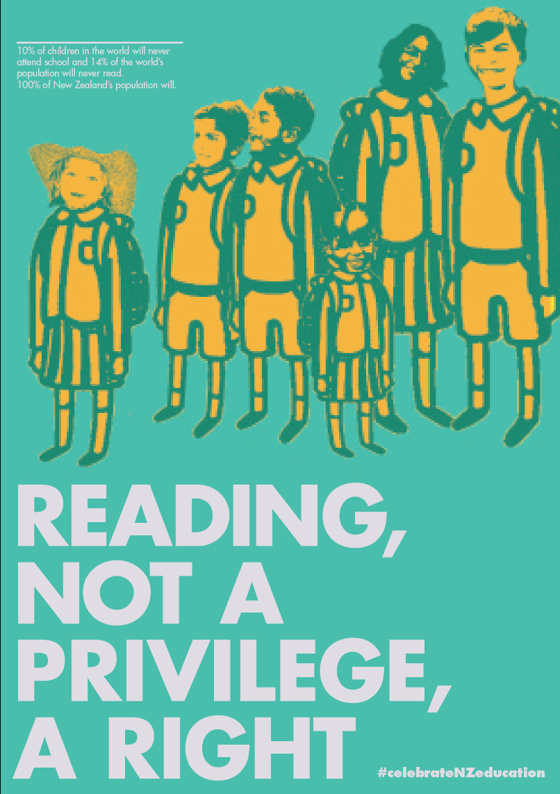
47% of the worlds children are never expected to enter school. 
100% of New Zealand's children are. 
Let's celebrate our privileges globally. 

What I am saying I must use logos and ethos predominantly. My topic is commonly argued so therefore I need to have strong factual information that convince and endorse what we have, so readers see my posters and think, yes we do. 

You can quote sources on your posters, so really source the information I find. 

New Zealand is an equal society - everyone has the same access to the same stuff. This is a logical argument that needs to be told through comparisons. 

Target audience:
People in their early 20's going onto raising children, to make them aware New Zealand is a good place for people to raise children. 

I should keep my work race and gender neutral. 

To do from here:

- Go back to the statements, these concepts have helped me to come up with some ideas but now I am needing to go back and really refine the statements, information and wording on the posters. 
- Create 10 comparative statements - fact, counter fact and message/action + organisation. 
- Create 10 developments from these new 10 statements