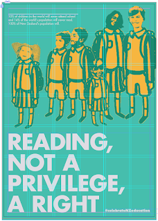
Critique with Jacquie and Matt:
From this critique I have a lot of points to work on - see notes. From here I will develop it before the end of class and then get another critique on this and hope this is well resolved.
Developing further:
Developed the eye - this is now more balances and looks more interesting and less distracting.
Looking and ensuring my work fits within my grid.
Lightening the orange eye a little bit more and really refining the type layout.
Starting to change and develop the type further.
This text layout is nicer but the overlapping of the legs with the text is distracting, the colours look much nicer together.
This is starting to look better and the text with the image is working together more.
This is looking like a much better layout, you read the text and then follow through to the much smaller type of the hash tag
This works better with the use of bigger type and the body copy text works well.
This aligns to the grid as well. I am feeling confident with these two designs and will make some minor changes over the weekend so I can go and print the two designs next Monday.
Crit with Matt before class finishes:
They are looking better, but think about the alignment the text, size and colour and the positioning. This is very close to completion and starting to look resolved.Try with the second poster having the people in-front of the text? and the colour scheme is a bit boring.


No comments:
Post a Comment