Final Poster 1 -
Final Poster 2 -
Rationale -
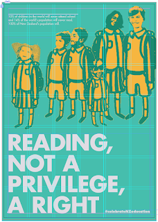
In response to Ihi Wehi I have created two persuasive posters that communicate New Zealand having an equal education system. One that gives everyone the right to have literacy skills, learning to read and write - comparing NZ to other countries where only the privileged attend school. My concept is to celebrate our state education as it means equally everyone in New Zealand will learn and attend schooling.
My audience is people who are thinking about having children or already have young children, it is a poster which communicates the idea of bringing up children in New Zealand. It means potential children are going to have an equal chance from our quality state education system. They are targeted through my two posters with the imagery used, such as children’s eyes, faces and the ‘drawing’ feel of the uniforms, this target audience would be drawn to imagery surrounding children.
My design concept of poster one responds to my chosen subject matter of education through the use of eyes as a representation of the convention used to read. The poster is predominantly photographic with the use of overlays and illustrative eyes to add texture and depth to the design. The use of colour in this poster helps to create visual hierarchy and flow, as when viewing the poster you are firstly drawn to the bright orange eyes, then read the red heading and bold subheading then flow downwards onto the body text, leaving the poster with the call to action being the hashtag “celebrateNZeducation”. This poster relies strongly on a logos argument to persuade through factual information, the Ihi in this poster is the physical eyes and colour, drawing you to read the poster. The Wehi is the emotions you feel such as grateful and uplifted once you have read the poster and understood that we are lucky to be in New Zealand a country with such a great education system.
The design concept of my second poster uses threshold techniques to turn images into something similar to drawings. The use of the children in school uniforms, which appear to be hand drawn, enforces the idea of learning and drawing being a convention of literacy. The happy children relates to pathos as viewers feel as though, with the use of the logos text, these children from different backgrounds have equal opportunities at a good education in New Zealand as they appear as equals. The type is bright red which draws you to the poster to read its subject and then with the red hashtag your eyes bounce up to the top to then read the body copy, this hierarchy helps to read the poster in an upbeat, uplifting manner which leaves you inspired by our country.
In the 'real world' -
Mounted posters -
In response to Ihi Wehi I have created two persuasive posters that communicate New Zealand having an equal education system. One that gives everyone the right to have literacy skills, learning to read and write - comparing NZ to other countries where only the privileged attend school. My concept is to celebrate our state education as it means equally everyone in New Zealand will learn and attend schooling.
My audience is people who are thinking about having children or already have young children, it is a poster which communicates the idea of bringing up children in New Zealand. It means potential children are going to have an equal chance from our quality state education system. They are targeted through my two posters with the imagery used, such as children’s eyes, faces and the ‘drawing’ feel of the uniforms, this target audience would be drawn to imagery surrounding children.
My design concept of poster one responds to my chosen subject matter of education through the use of eyes as a representation of the convention used to read. The poster is predominantly photographic with the use of overlays and illustrative eyes to add texture and depth to the design. The use of colour in this poster helps to create visual hierarchy and flow, as when viewing the poster you are firstly drawn to the bright orange eyes, then read the red heading and bold subheading then flow downwards onto the body text, leaving the poster with the call to action being the hashtag “celebrateNZeducation”. This poster relies strongly on a logos argument to persuade through factual information, the Ihi in this poster is the physical eyes and colour, drawing you to read the poster. The Wehi is the emotions you feel such as grateful and uplifted once you have read the poster and understood that we are lucky to be in New Zealand a country with such a great education system.
The design concept of my second poster uses threshold techniques to turn images into something similar to drawings. The use of the children in school uniforms, which appear to be hand drawn, enforces the idea of learning and drawing being a convention of literacy. The happy children relates to pathos as viewers feel as though, with the use of the logos text, these children from different backgrounds have equal opportunities at a good education in New Zealand as they appear as equals. The type is bright red which draws you to the poster to read its subject and then with the red hashtag your eyes bounce up to the top to then read the body copy, this hierarchy helps to read the poster in an upbeat, uplifting manner which leaves you inspired by our country.


