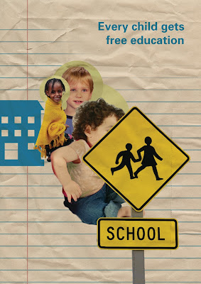
Poster 1 - Concept 1:
This poster is a good first concept, it has the symbolism of the ring around the children's heads showing they are godly, they are all equal and of different genders and race. The composition with the text stands out as you read every child gets free education understanding that all children have the same rights to education in New Zealand.
Poster 2 - Concept 1:
This second poster is playing on the minds of children and their drawings, visually it has a lot of work to be done with design principles being very unclear and not too attractive, but this poster is interesting as I have used the medium of children's drawings.
Poster 3 - Concept 1:
This third poster focuses on kids and their rights to free education in new zealand. By removing their faces and covering it with the words it shows that every child no matter what background gets free education. This is a very simplistic design which relies heavily on the photographic background and if I will continue to use imagery like this I would be needing to produce my own images.
Poster 4 - Concept 1:
This final concept I am thinking is similar to an eye chart with the simplistic composition easily legible with impact on the eyes. The wording really needs working on and really this is an average poster design.
Poster 5 - Concept 1:
This poster us a very clean look with simplistic words and the use of the happy children. The poster has a good visual flow and the circles help you to flow around the page with you reading through and on bottom right the word equality which leaves you thinking of this poster meaning equality.


No comments:
Post a Comment